Gifzi
The Shift
From multi-step, confusing flows
To instant, frictionless gifting
What I Did
| Role | Product Designer |
|---|---|
| Type | Client Work |
| Output | 44 Screens + Branding + UX Flows |
| Timeline | 2 Months |
Redesigned the entire product experience — not just screens, but how gifting works.
The Problem
In the existing product:
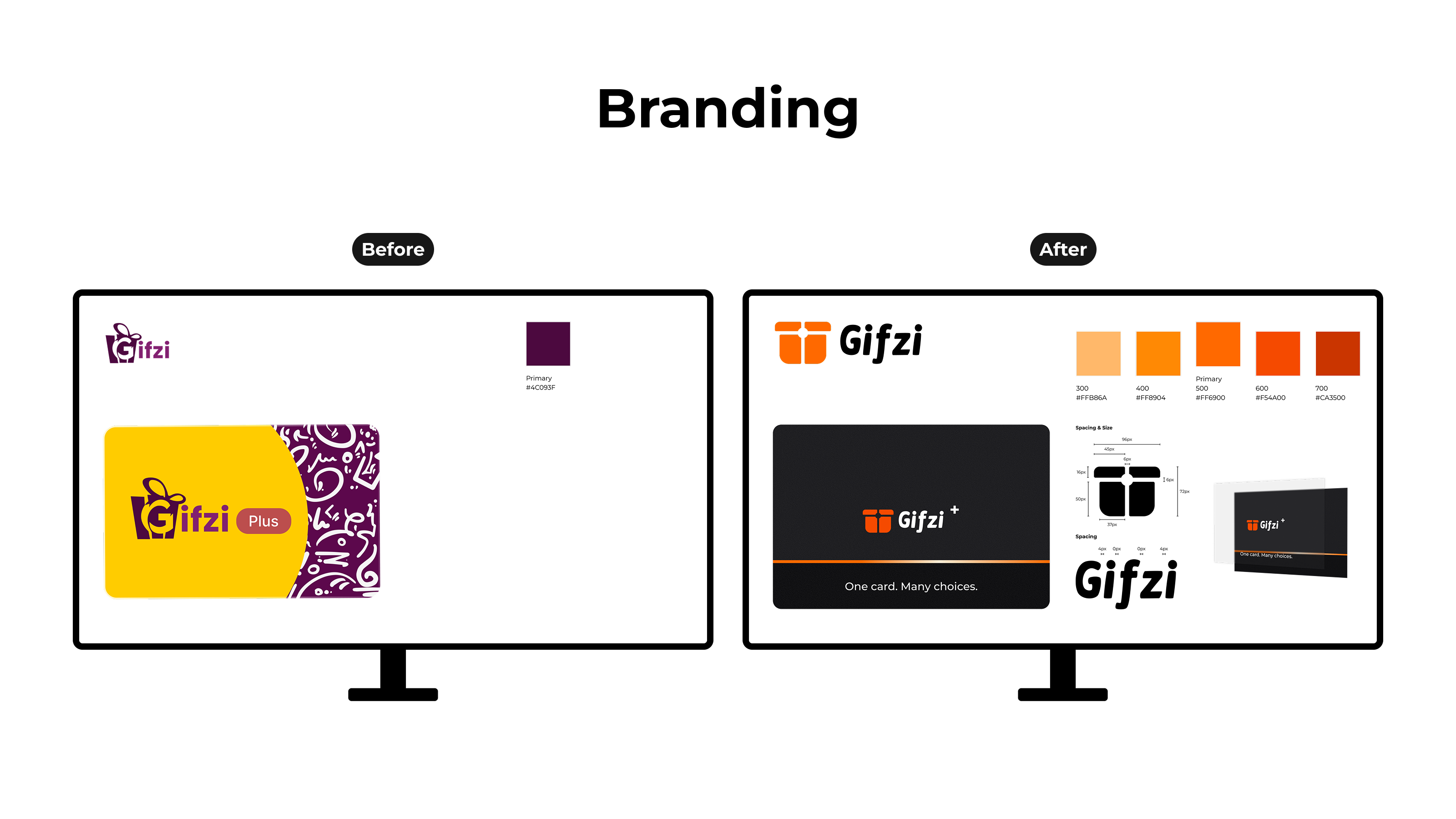
- Branding and visual identity lacked consistency
- Systems (Coins, Plus) felt disconnected
- Slow, interruptive experience
- Too many steps to purchase
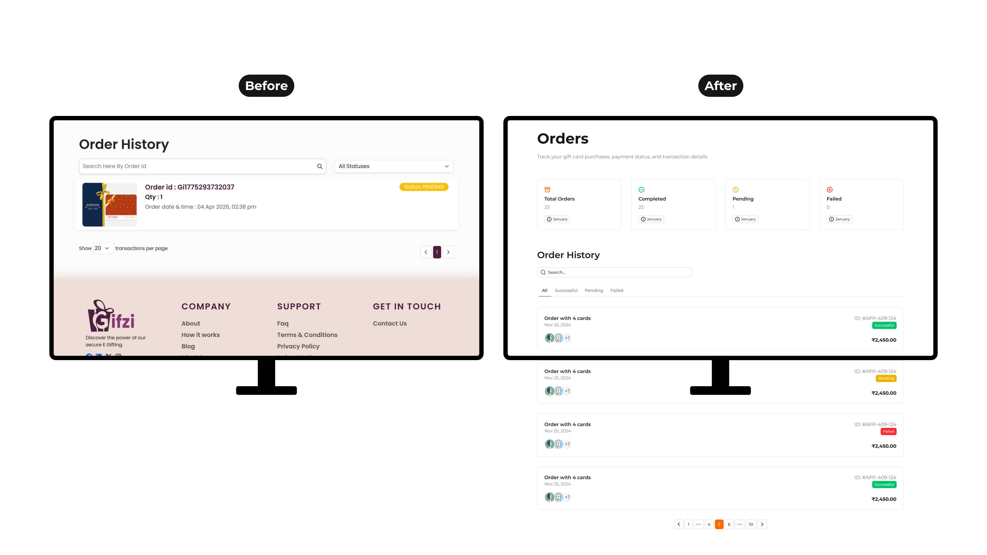
- Hard to find gift cards
A “quick gift” didn’t feel quick.
The Breakthrough
I didn’t just redesign screens — I redesigned the system.
I led a complete redesign of the platform — covering UI, UX flows, branding, and system consistency.
3 Decisions That Changed Everything
1. Search > Browsing
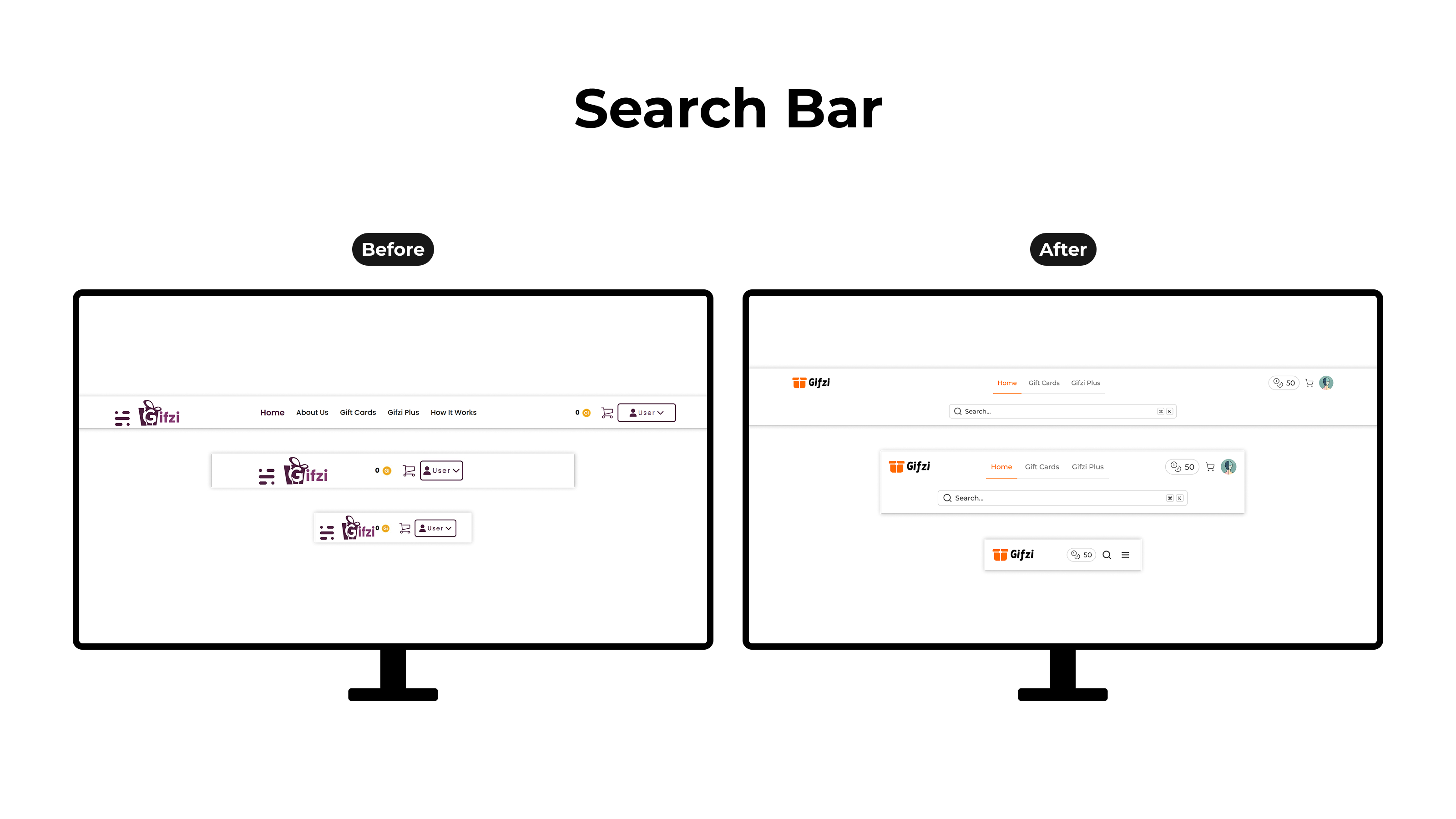
Users don’t explore — they know what they want.
Search became the primary action.
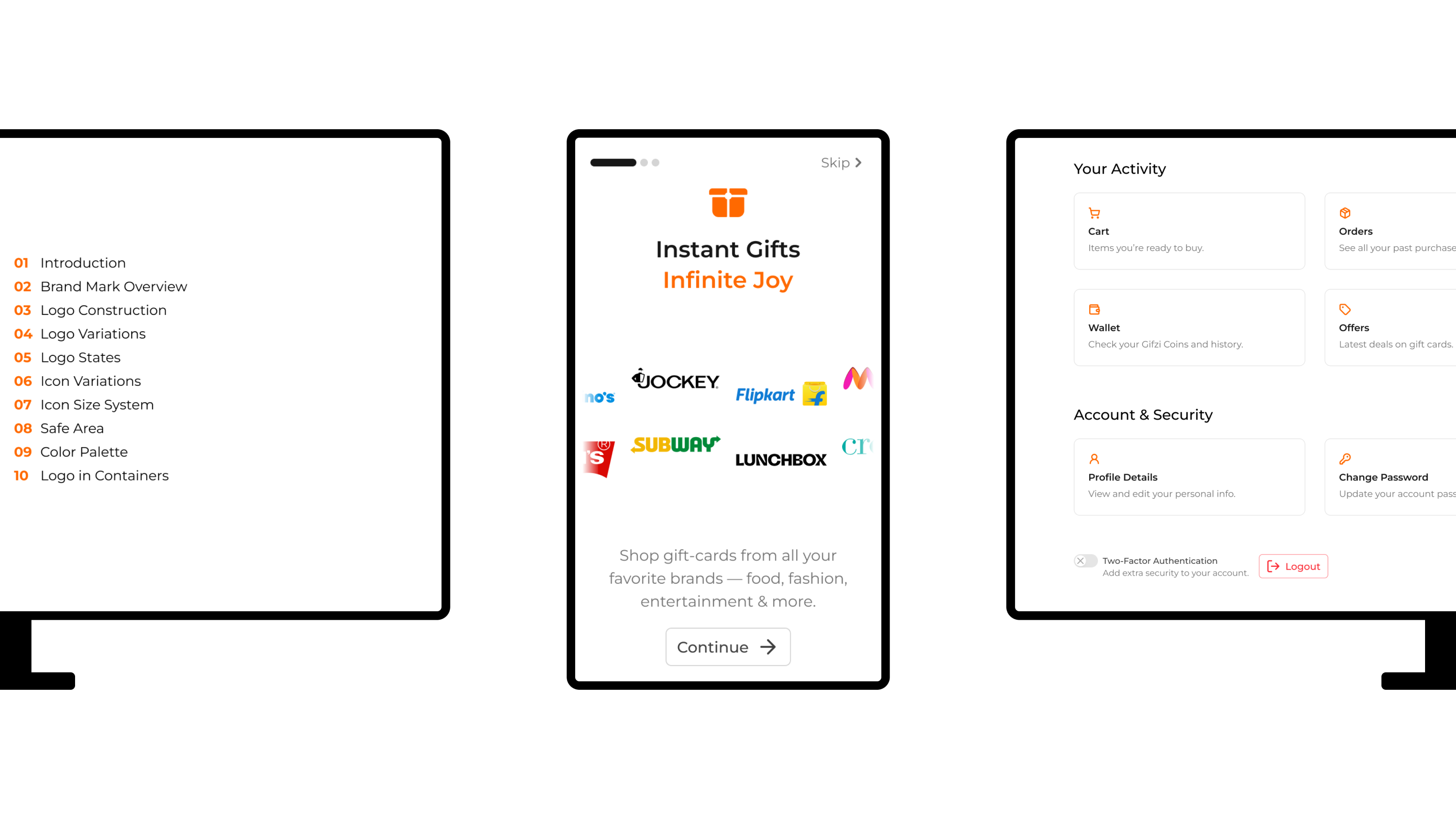
2. Merge the System
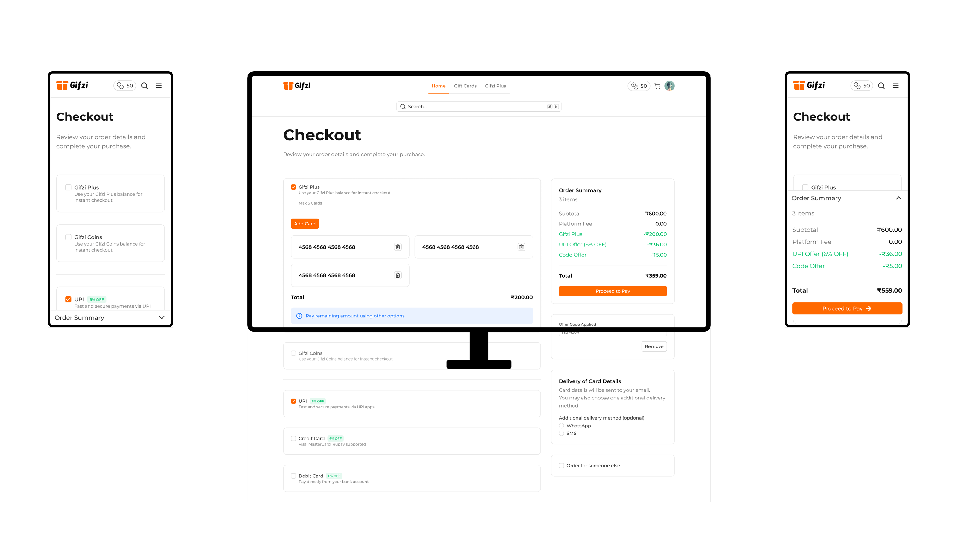
Gifzi Plus + Coins were fragmented.
I unified them into one seamless layer inside checkout.
3. Faster Decisions
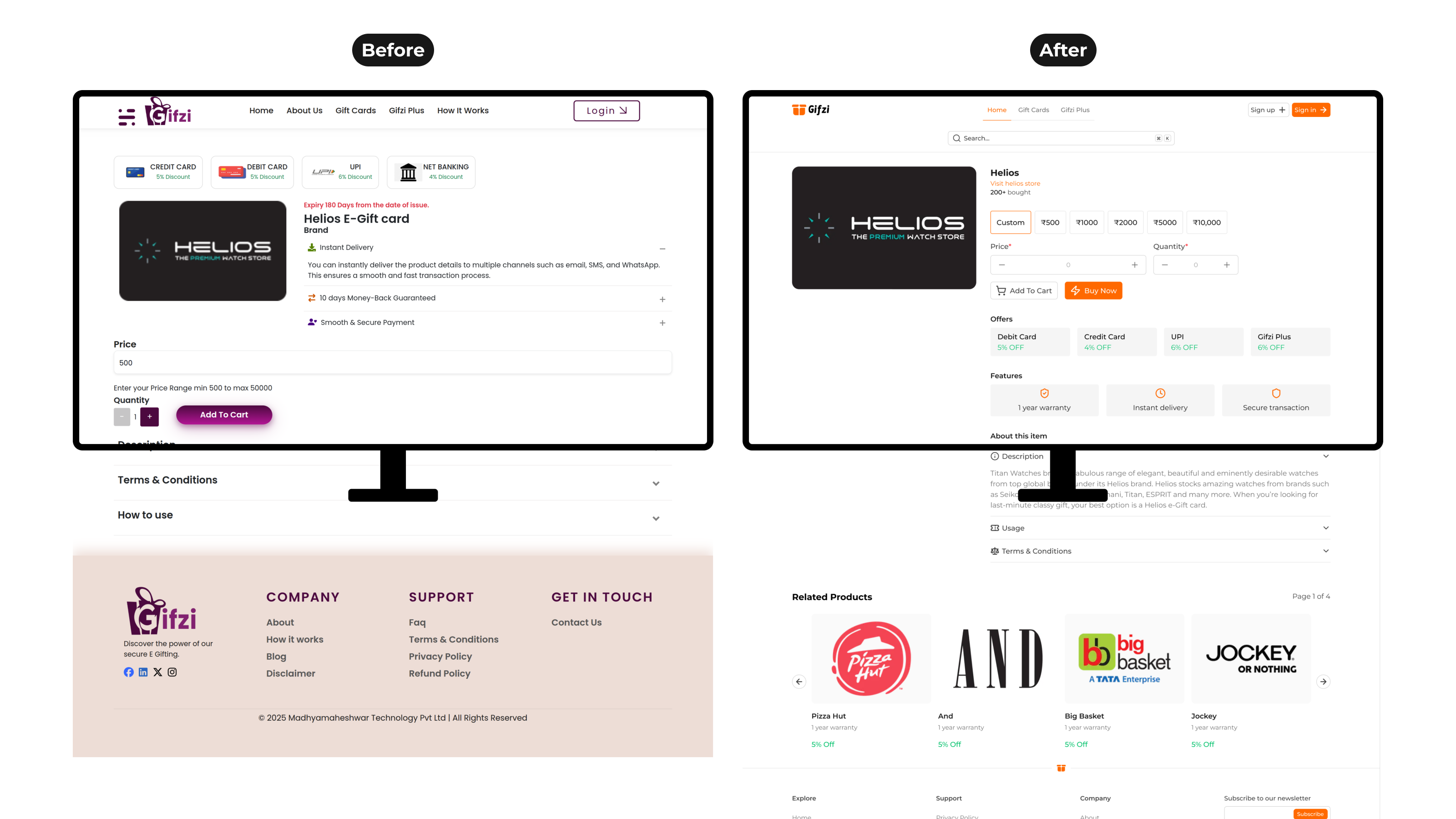
The original flow slowed users down with a single path (Add to Cart).
I introduced:
- Buy Now for instant purchase
- Related products for quick discovery
Reducing friction at the moment of decision.
Designed for Speed
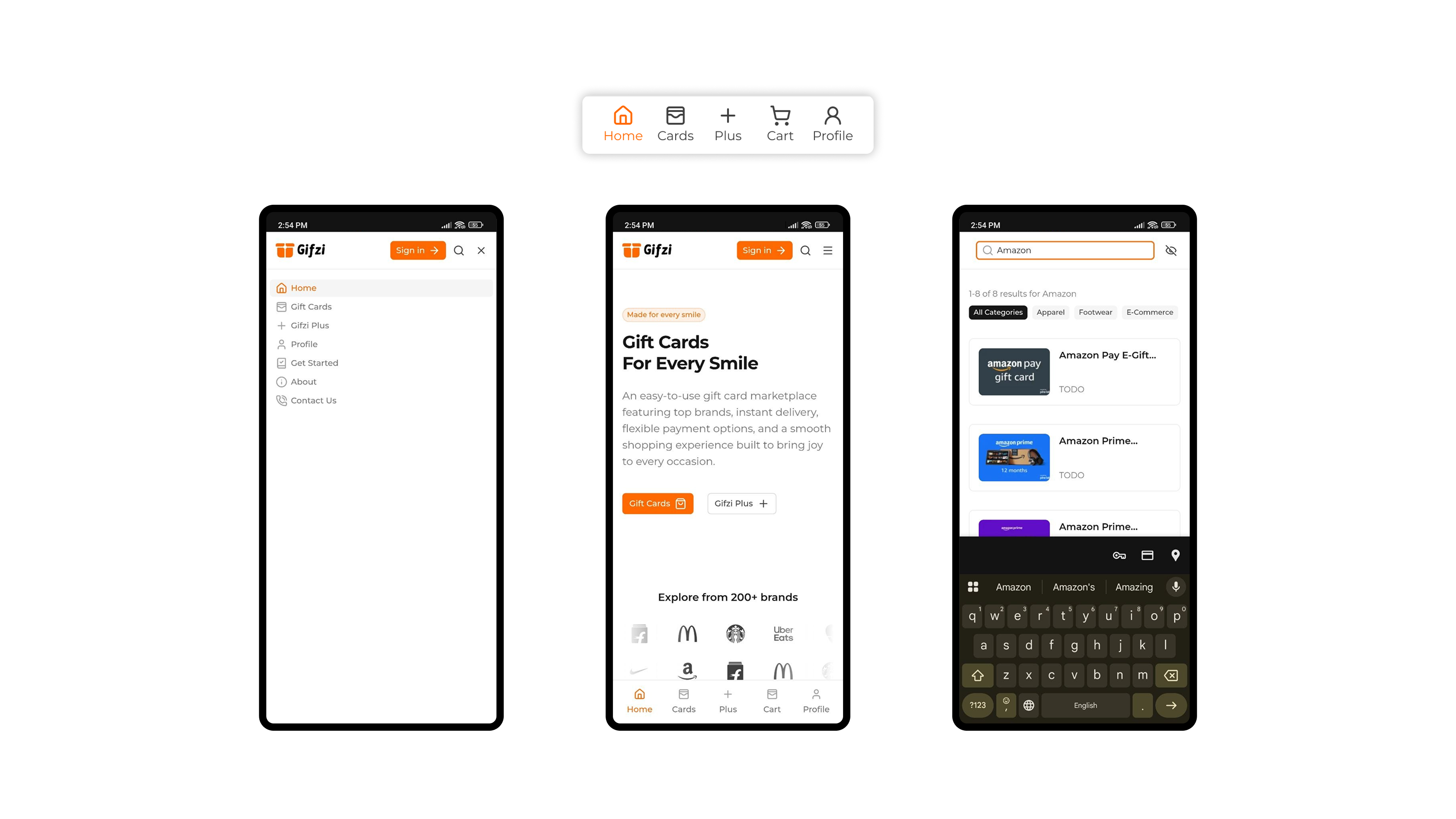
- Mobile-first interactions
- Thumb-friendly navigation
- App-like experience on web
Built to Scale
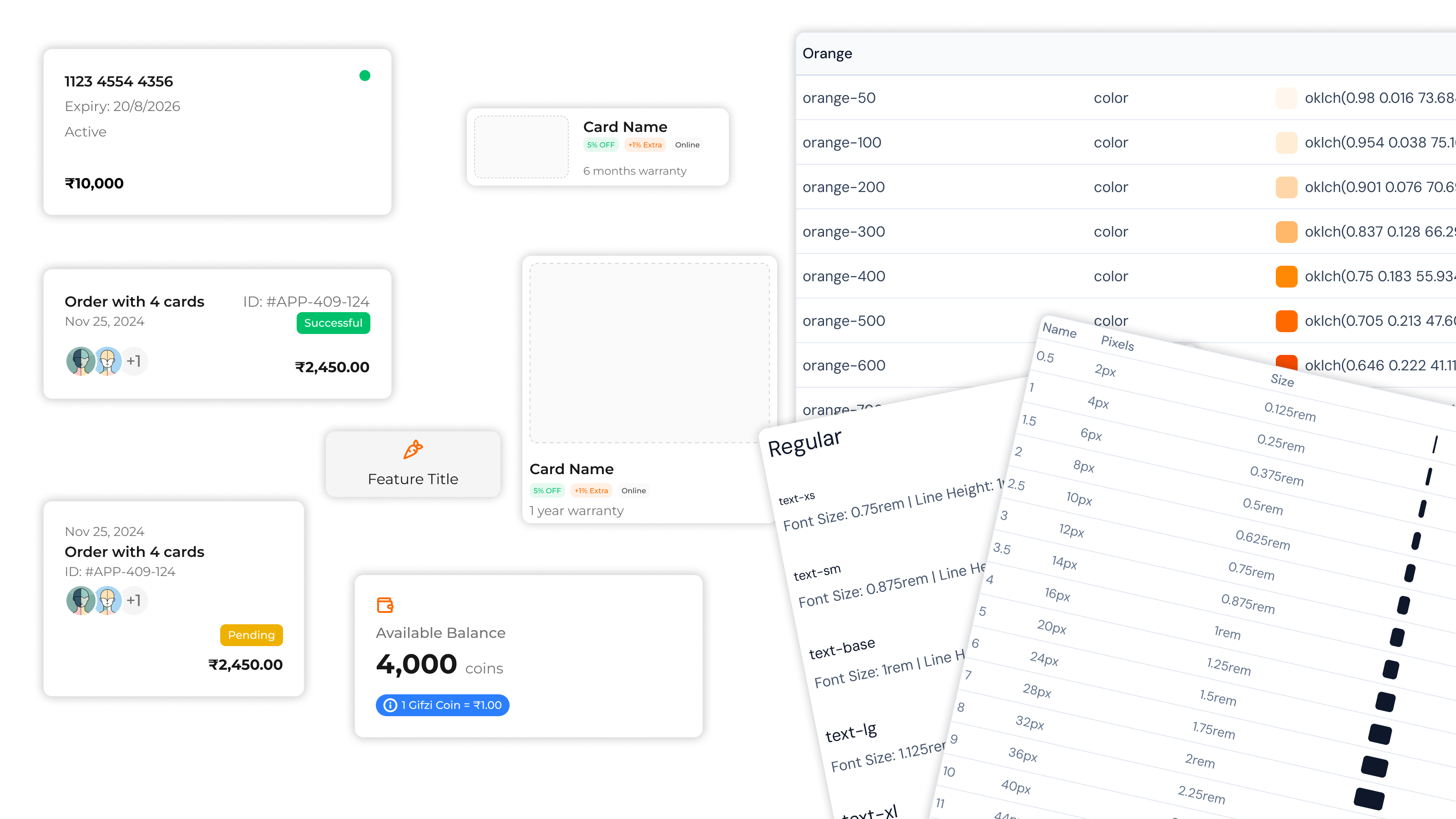
Instead of isolated screens, I created a system:
- Reusable components
- Consistent patterns
- Extended from Nuxt UI
Impact
- Reduced friction across key flows
- Faster purchase experience
- Clear, scalable design foundation
Delivered 44 screens across all platforms.
Want to See More?
This is just the surface.
The real value lies in:
- Iterations
- Trade-offs
- UX decisions
Happy to walk through the full process.